የአውቶደር LED ገ dilig በተመለከተ፣ የፖኔሞን ኢንስቲትዩት በ2023 ዓ.ም. ያደረገው ጥናት መሰረት ሰዎች ምስሎችን በግልፅ ለ0.8 እስከ 2.3 ሰከንድ ብቻ የሚመለከታቸው የተነሱ አካባቢዎች ውስጥ በጣም ጥሩ ይሠራሉ። ስለዚህ በዚህ ዘመን ጥልቅና የቀላል ዲዛይኖች በጣም ይገলባሳሉ። ይህ የማዘጋጃ ዘዴ ብሩህ የቀለም ግ противопоставление፣ ትላልቅ ፊደላት እና የቀላል ዲዛይን ይጠቀማል፣ ከዚያ የአእምሮ መልዕክቶችን በፍጥነት ለማወቅ ይረዳል። በጣም ጥልቅ ፊደብ ላይ የተጻፈ አንድ ቃል ብቻ የሚያካትት የሚታወቁ ዘዴዎችን ያስቡ። ከ2025 ዓ.ም. የዲዛይን ዘመናዊ አዝማሪ ሪፖርት መሰረት፣ ሰዎች እንዲሁ ያሉ ማስታወቂያዎችን ከሙሉ ጽሑፍ የተሞሉ ማስታወቂያዎች በ19 በመቶ በላይ ለማስታወስ ይገባል። ይህ ሲገመት የአውቶደር ማስታወቂያዎች ላይ ማስተዋል ለማግኘት የሚኖር ጊዜ በጣም ግልጽ ነው።
የሚገፋ መልዕክቶችን ያለ ማስቀመጫ አካላት ወደ 3–5 ቃላት ያድርጉ። ከከተማ ግቢያዎች ውስጥ ያሉ የአሳሽ የ LED ድረ-ገፆች “የተወሰነ ጊዜ ያላቸው ስብስቦች” ሲሆኑ “አሁን ሻል” ያሉ የተቀላቀሉ መልዕክቶች ከፍተኛ ተዛማጅነት ያሳያሉ። ይህ የሞግዕ አካል ጥበቃ ጥናት የሚያሳይው ከፍተኛ እንቅስቃሴ ያላቸው አካባቢዎች ውስጥ ፊደላት አጠቃላይ ምርጫ ነው ማለታቸው ነው።
የእርዝመት ምርጫ ግሩማ ይመራል፡
| ቴክኒክ | አቅጣጫ |
|---|---|
| 40–60% የአካባቢ አራፍ | +33% የCTA ላይ ፍጥነት ግሩም (A/B ፈተናዎች) |
| የጎን መጠቆሚያ | የሎጎ ማስታወሻ 22% ይጨምራል |
ሺዳማ ወይም ሐያል የ LED ድረ-ገጽ ውቅር ይፈጥራል 41% የተሻለ የማህበራዊ ማካፈል ከአራት ማዕዘን ቅርጽ ጋር ሲነፃፀር በጣም አስፈላጊ ነው (የማህበረሰብ ሚዲያ ትንተና 2024)። ረገድ ላይ ያሉ ሰዎች ረጅሙ ጊዜ ለመቆየት የሚያስችል ቦታ ላይ መለዋወጫዎች 15–30° ኣንግል ላይ በማስቀመጥ ይጨምሩ ።
የአውቶ ማሳያ መብራቶች ለመጠቀም ሲሄዱ፣ ከ100 ጫማ በላይ ርቆት ላይ ካለ ሰው ለማነድ ቢያንስ ሶስት ጊዜ የሚበልጥ የጽሑፍ መጠን ያስፈልገዋል። 1/150 ዓመታዊ ደንብ የሚባለው ነገር አለ፣ ይህ ደንብ የጽሑፍ ቁመት ከእሱ ጋር የቆመ ሰው ያለበት ርቀት ከአንድ ግማሽ ከተናደፈ ጋር ተመሳሳይ መሆን አለበት ማለት ነው። ስለዚህ ከ100 ጫማ ርቀት ላይ ከቆመ ሰው ጋር የተገናኘ ምልክት ለማየት፣ በአማካይ የ8 ኢንቺ የከፍታ ፊደላት ያስፈልጋል። ከአገሩ ውጭ ያሉ ምልክቶች ፕሪንቲር ኢንስቲቲዩት የመጨረሻው ዓመት የታተመውን መሰረት፣ የጽሑፍና የቅንባት መካከል ያለው የניגוד ጥምርታ ቢያንስ 4.5 ለ1 ከሆነ በጣም ብሩህ ባለ ቀን ላይ ምን ላይ እንደሚታይ ለማወቅ ያስችላል። እንዲሁ የተቀላቀሉ የሌሉ ፊደላት ያለው የአሪአል ወይም ሄሊቨቲካ ያለው ፊደል ሲታይ ከተለያዩ የተቀላቀሉ ፊደላት ጋር ሲነፃፀር አንድ ሰው በአንድ ሰከንድ በማነድ በፍጥነት ሊያውቅ ይችላል። የMIT AgeLab የዚህ ተጽእኖ በግልጽ የሚያሳይ ጥናት አካሂዶ ነበር።
ነጭ ባለው ግራኞች በሌሎች የተንሸራታቸው በማይገኙበት ጊዜ በ22% የተሻለ ስሜት ያስገኛል፣ የወርቅ ጽሑፍ ላይ የጨለመ ግራኝ በቀጥታ ፍላሽ ውስጥ በ19% የማስታወስ ችሎታ ይጨምራል። የ2022 ዓ.ም የMIT ጥናት የአውቶሞቢል መንገዶች ላይ ያሉ ፒሳኖች ላይ የሚጠቀሙ የፍሩቲጀር ፊደላት ከካሬ-ግሮቴስክ የፊደል አይነቶች ጋር ሲነፃፀር የሰዋሪ ግስ ማስከተል በ10.6% ይቀንሳል ብሎ ሰረዝቶ ያሳያል፣ ይህም የፊደል ፍቀድ በተለያዩ የማየት ሁኔታዎች ውስጥ የተለየ ጉዳይ መሆኑን ያረጋግጣል።
| የማየት ርቀት | tối thiểu የጽሑፍ ቁመት | የተቃራኒነት የሚያስፈልገው |
|---|---|---|
| 50 ጫማ | 4 ኢንቺ | 5:1 (ቀን) / 3:1 (ሌሊት) |
| 150 ፌት | 12 ኢንቺ | 7:1 (ቀን) / 4:1 (ሌሊት) |
| 300 ጫማ | 24 ኢንቾች | 10:1 (ቀን) / 5:1 (ሌሊት) |
ከታመኑ የኤልኢዲ ግንባታዎች ላይ በከፍተኛ አንግል የፊደል ስፋት በ15–20% መጭስ ያስፈልጋል ከአንግል የሚመጣ የመገለጥ ችግር ለማስወገድ። ከቶኬዮ ሺቡያ ክልላዊ ሙከራዎች (2023) ግልጽ ሆኖ የሚታየው ከአካባቢ የሚገኘውን ምክንያታዊ ሴንሰሮች ተከትሎ የብርሃን ጥንካሬ እና መጠን በነጻ ሊቆጣጠር ይችላል ይህም የእግረኛዎች ተሳትፎን 41% ያሳድጋል
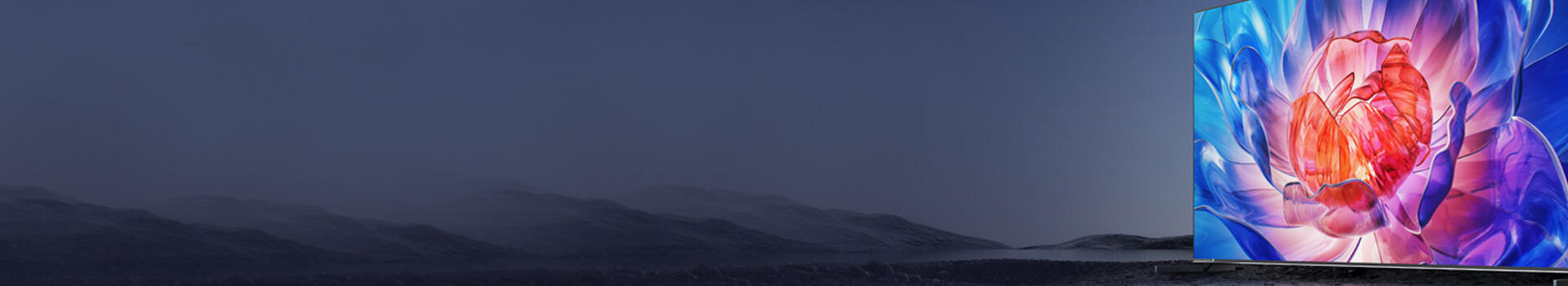
ትላልቅ የውጭ ገ dilig ላይ የዝቅተኛ ስኬል ምስሎች ፍጥነት ያለ ይበላሻሉ። 4K ስኬል (3840x2160 ፒክሴሎች) ወይም ከዚያ በላይ ያስቡ፣ እና የፒክሴል ማጣጃ ለማስወገድ የቫክተር ግራፊክስን የራስ្សር ምስሎች ላይ ያቀድሱ። ከዲጂታል ሲግኔጅ ፌዴሬሽን ጋዜጣ (2023) ግልጽ ሆኖ የሚታየው ከ100ppi ባነሰ ያለው ሲግኔጅ ከ150ppi የሚገ촉 ሲግኔጅ ጋር ሲነፃፀር 37% የትንካሬ ተሳትፎ ያነሰ ነበር
visuals የበለጠ ከተራቀሙ፣ ሰዎች በእነዚህ የከባድ ግንኙነት ያላቸው ክፍሎች ውስጥ ምን እንደተመለከቱ ማስታወስ ያቆማቸዋል። የቪዚናል ኮግኒሽን ኢንስቲቲዩት የመጨረሻው ዓመት ያደረገው ጥናት አንድ ዋና አካል ላይ ትኩረት ያደረገ እና ቀላል ዳርቻ ያላቸው ማስታወቂያዎች ምemory memory ውስጥ በጣም ሆኖ ይቆያሉ ፣ ከዚያ የተዘፈቀ ዲዛይኖች የሶስት ግማሽ የበለጠ ተጽዕኖ እንዳላቸው ያሳያል። ከሌላ ጎን መልዖ መልዕክቶች ለማንሳት ፣ ብዙ ማስታወቂያ አቅራቢዎች አሁን ምርቶችን ወይም ዋና ጽሑፎችን በራስ ግፊት የሚያብሩ ግልጽ ሶፍትዌር ወደ ግዙአዊ ይሄዳሉ። እና የተወሰኑ አውታሮችን ሲስተም ከሆነ ፣ በግ около በቂ ነፍስ የሚተወ ሁኔታ ያላቸው ምስሎች ረገድ የተሞላ ሲሆን የወደፊት የይዘት ማዘመኛ በጣም ቀላል ይሆናል። በአብዛኛው ሁኔታዎች ውስጥ ባዶ ቦታ ከ 30% በላይ ሳይሆን በጣም ግልጽ ያልሆነ ሁኔታ ለማድረግ ጥሩ ነው ።
የአንስተኛ መჩረሻዎች ተስማሚ የሆነ ዲዛይን ያገኙ—ዋና ዋና ምስሎች 60–70% የመጠን ጥብቅ አካፍለው የሚሰጡ የሞዱላር ማቆሚያዎች ፍጠር። የቦታ-ተኮር የCTA ማቆሚያ ለማድረግ ቦታ ይተዉ። በከተማ ውስጥ ያሉ 12 የመበደል ፕሮጀክቶች ላይ የተደረገ ኤ/ቢ ፈተና የተቀነሰ ዲዛይን ከጠንካራ ፊደል ጋር 22% የበለጠ ሰው ማጣት እንዲሁም ከተገናኘ አኒሜሽን የበለጠ አፈፃፀም እንደያሳዩ ያሳያል (የአውትዶር ማስታወቂያ ማህበር፣ 2024)።
ጥሩ ግብይት የሚጀምረው ብራንዶች ከማን ጋር እንደሚያወሩ በትክክል ሲረዱ ነው። ሰዎች በትክክል የሚሄዱበትን ቦታ መመልከት ብዙ ጉዳዮችን ነው። ለማስታወቂያዎች ጣፋጭ ቦታዎችን ለማግኘት እንደ ባቡር ጣቢያዎች፣ የገበያ ማዕከሎች እና ትልልቅ ዝግጅቶች ያሉባቸው ቦታዎችን ይመልከቱ። ቁጥሮቹም አይዋሹም። ጨዋታዎች ሲበሩ በስታዲየሞች ዙሪያ ያሉ ዲጂታል ስክሪኖች መደበኛ የማስታወስ ችሎታ ያላቸውን የማስታወቂያ ሰሌዳዎች በ37 በመቶ አሸንፈዋል። ሰዎች እዚያ የበለጠ ትኩረት ይሰጣሉ. እና ስለ ወቅታዊ ነገሮችም አንርሳ። የ LED ማሳያዎችን መከራየት ከቤት ውጭ ባለው ሙቅ እና ቀዝቃዛ ላይ በመመስረት ማስታወቂያዎችን ማንቀሳቀስ ያስችላል። በጋ ማለት የባህር ዳርቻ ማርሽ ማስታወቂያዎችን በባህር ዳርቻ መንገዶች ላይ ማስቀመጥ ሲሆን ክረምት ደግሞ ከተራራ ሎጆች አጠገብ የበረዶ መንሸራተቻ መሳሪያዎችን ማስተዋወቅ ይጠይቃል። ትርጉም ይሰጣል አይደል?
የዘገባ ዝግጅቶችን የመንግስት ስርዓቶች ጋር ያስተማማኑ
የኤል ኤድ ገጽታዎች በከተማ ውስጥ ያለውን ድብ dub ሁሉ ሲያሸንፉ ማህበራዊ ምዝገባ እንደገና እንዲታይ የሚረዱ ጠንካራ መሳሪያዎች ይሆናሉ። ኩባንያዎች የእነዚህ ዲጂታል ምልክቶች ላይ ያሉትን የመለያ ገ colors እና ምልክቶቻቸው በቋሚነት የሚያቆሙበት ጊዜ፣ የአንደኛ ደረጃ ማስታወቂያዎችን በማወቅ ሲነፃፀር ሰዎች ማህበሩን በግምት 40 ባለመቶ በተሻለ ይስማማሉ እንደሆነ የቀደመው ዓመት የማኔጀመንት ሳይንስ ኢንስቲቲዩት ጥናት ያሳያል። የአርማ ገ color ያላቸው የትልቅ ጽሑፍ ጥንዶች ለአብዛኛው ሰው ማራዘሚያ ምልክት ያስገኛል። የ2023 ዓ.ም. የማስታወቂያ ላይ ያለ የቀለም ሳይኮሎጂ ሪፖርት ይህን ያረጋግጣል፣ የገበያ ሰዎች ሦስት ግዜ አራት በቀለሙ ብቻ ማህበራዊ ምዝገቦችን ይለያያሉ፣ ሌሎች ነገሮችን ማንም ስላያን ነው የሚሉት።
ጠንካራ የተሳታፊ ፍላጎቶች (CTAs) በዋናነት ጊዜ እና ስለሆነ የቀላልነት ፍላጎት ያስፈልጋቸዋል። 'መግዛት'፣ 'ማስቀመጥ' ወይም 'ማግኘት' የሚሉ ቃላት ከ'ዛሬ ምሽት ይቆጥማል!' የሚሉ ጊዜ የተገደቡ መልዕክቶች ጋር ተዋህዶ ሲጠቀሙ የበለጠ ጥሩ ውጤት ይሰጣሉ። ከአውሬ የዲጂታል ማስታወቂያ አዝማሪ ጥናት መረጃ ከተገኘው መረጃ አንፃር አቅጣጫ የሚያሳዩ ነገሮች እጅግ አስፈላጊ መሆናቸው ይታወቃል። ለምሳሌ የ QR ኮድ አቅጣጫ የሚያሳዩ የማያውቁ አቅጣጫ ናፍቆች በዘግ የመጓጓዣ አካባቢዎች ላይ የመሳሰል ሁኔታ የሚጨምሩት በግምት 34 በመቶ ነው። እነዚህን ዋና የመብከኛ እንቅስቃሴ ጥሪዎች ዩ እንዴት መጻፍ አለብን? የማንኛውም ማያ ከላይ ክፍል በጣም ተስማሚ ይመስላል፣ ምክንያቱም ከዚህ የበለጠ የሚታይ የሚሆን የኦኤች የዓይን መከራ ጥናት የሚያሳየው የቤር ማስታወቂያዎችን ሲመለከቱ ሰዎች በመጀመሪያ ላይ የሚመለከታቸው ቦታ ከ82 በመቶ በላይ ከላይ ክፍሉ ነው። እዚህ የሚደረጉ የትንሽ ልውውጦች የመልዕክቶቻችን ተጽእኖ ለማድረግ ትልቅ ልዩነት ሊፈጥሩ ይችላሉ።
በኩሬ ኮድ ስካን እና በመቆየት ጊዜ መለኪያዎች የተከታተለ ውጤታማነት (በ2024 ዓ.ም ዓመት ውስጥ በዓመት 29% የበለሻ)። ሙቀት ካርታ የሚገኘው የመግቢያ ምልክቶች ከአቅራቢያ ያሉ የተለዩ ሕንፃዎች ጋር ያላቸው የኘሶ ግፊት መጠን 23% የበለሻ መሆኑን ያሳያል። የእጅ ላይ የሚታይ የኤልኢዲ መჩረሻዎች ለመከራ ግንኙነት መረጃ ጋር የእግር ጉዞ መረጃ ያዋሃዱ እና ጊዜ፣ ተደጋጋሚነት እና መልዕክት ለማሻሻል ይጠቀሙ።

